In the bustling underbelly of New York City, where the rhythmic clatter of trains becomes a meditative backdrop to the morning commute, creativity doesn’t always take the backseat. For Phil Imbriano, a senior designer at Topps, the daily journey wasn’t just a routine transition from home to office—it was the setting for a serendipitous eureka moment destined to shape the baseball card landscape of 2025.
While the train wound its way through the heart of Manhattan, it was a simple red-and-silver badge nestled in the corner of a subway car that caught Imbriano’s discerning eye. Captivating in its understated elegance, the badge encapsulated a sleekness he couldn’t ignore. He captured it with a quick snap on his phone, a snapshot that would journey with him beyond the confines of his subway seat to his creative workspace at Topps. By the time his stop came around, his mind was already awash with the first sketches of what would become the signature design for the 2025 Topps Series 1 baseball cards.
“I love drawing inspiration from everyday things,” Imbriano shares, his enthusiasm for the creative process evident. “It could be a building, a sign—just something that catches my eye. I take pictures and refer back to them later. You never know when something simple will turn into something big.”
Thus, the 2025 design was born, characterized by two bold lines sweeping majestically up the left side and across the top of the card. Some collectors, connoisseurs of iconography, might find it familiarly reminiscent of the 1982 Topps set. Yet, this wasn’t an intentional homage. Initially, Imbriano leaned into the textures of the woodgrain aesthetic that defined the 1962 and 1987 sets. “The ’82 connection was a happy accident,” he acknowledges. “But I think it works because it blends vintage style with a modern twist.”
This aesthetic harmony wasn’t simply slapped onto paper. Topps curates its designs through a rigorous in-house vetting process, akin to a reality competition for art enthusiasts. Designers submit various concepts, each undergoing an intense elimination process. Imbriano’s design emerged victorious from over 20 submissions, a triumph over a months-long array of creative explorations. Here, echoes of past designs often whisper into the present, with some non-winning elements resurfacing in unexpected future iterations—a testament to the evolving journey of design at Topps.
Take, for instance, the nuanced yet distinct field graphic marking the player’s position subtly etched into the bottom right corner of Imbriano’s winning design. Such details encapsulate the depth of thought in the process, which is far from a simple endeavor of aesthetics.
“There’s so much that goes into this process,” Imbriano notes, his voice underscored by genuine respect for the craft. “I don’t think most people realize how much work happens before they ever hold the card in their hands.”
Transitioning from digital renderings to tactile prototypes, Topps ensures every design is experienced just as customers will first encounter it—a sensory exploration akin to unveiling a magic trick, tune and intention perfected. This stage, as senior vice president of product Clay Luraschi outlines, is critical.
“When we’re down to the final five designs, we actually print them out and simulate opening a pack,” Luraschi explains. This ritual is more than internal ceremony—it is a spirited debate, the crux of office anticipations each year. Such care is integral to Topps’ philosophy, an homage to their storied 74-year legacy, from Sy Berger’s tabletop innovations to today’s high-tech evolution.
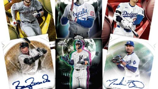
But Imbriano’s triumph isn’t merely a standalone exhibit; it’s the foundation for the broader Topps Series 1 universe, a portal into a variety of new sub-collections. Each subset extends an invitation into distinct facets of the baseball lore—Future Stars, All-Topps Team features, Spring Training vignettes, Hall of Fame tributes, and a celebratory City Connect Swatch Collection.
Echoing through this gallery is nostalgia, where modernity meets memory in the form of the 35th-anniversary tribute to the vividly bold, colorfully iconic 1990 Topps set. However, at the epicenter remains Imbriano’s design—a beacon on the horizon of collectible baseball artistry.
The conceptualization of a baseball card mimics the grandeur of a movie poster in Imbriano’s eyes. This intrinsic attention to individual artistry ensures each card occupies its self-contained universe, its narrative waiting to unfurl in the hands of a collector.
As Luraschi notes with enthusiasm, “I think Phil’s design is incredible. Fifty years from now, people should be able to look at a card and instantly recognize the year it’s from. This one absolutely nails that idea.”
Imbriano’s subway-inspired triumph not only encapsulates the heart of the 2025 Topps set but also echoes a resonant truth in art and sport alike: inspiration is often tucked in the most ordinary of journeys, awaiting discovery.


